I had some difficulties when trying to create my title page in InDesign which is what made me move onto using illustrator which I am a little more used to and know how to use better.
I was unsure of how to create my title page as I wanted it to represent a magazine cover but I was unsure of using an image of myself- especially as it would have to be quite a main part of the cover! A lot of the research I have done advises against using an image in a CV, but I feel that in this instance it works for the theme I have created and would look silly without one. Therefore I edited an image of myself on photoshop:
I did not do a massive amount to my image as I did not want it to look unrealistic! I did need to fit in with a magazine front cover though, so I tried to reduce any flaws to me skin and I edited my hips a little too! I also used a warming filter to warm up my skin tone and make it seem a little brighter. I chose this image as it is quite a natural one, yet still looks smart enough to be seen by an employer. I contemplated taking one especially for the cover, however, I think this would have looked to forced as I would have been aware of the camera and the fact it would be the front cover for my portfolio!!
After I edited the image I started to create the cover, using More magazine as inspiration:
I used a colour strip I had created for myself on kuler.adobe.com I kept this throughout all of my formatting stages to make sure there was always a consistent colour theme running throughout the entire portfolio.
I was really pleased with my design for my title page, I think it really represents a magazine and which is somewhere i would like to be in the future. It is colourful and vibrant and fun to look at. I particularly like the brush stroke across the front of the page as this is a new effect I have recently discovered on Illustrator which I will be making full use of in the future!
C.V:
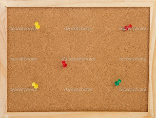
As I was using several copies of More magazine as inspiration, my CV layout design was also taken from their. They have recently started a new feature where they showcase women in creative jobs called the More Bulletin. This has a cork board background and looked really good and I thought it would be a perfect layout for my CV. I therefore created a title page for my personal profile and contact information and then used this cork board idea for the larger chunks of text.
I created my cork board background by cutting a frame out in Photoshop from an image off the internet. I also cut out a drawing pin template to use as decoration for when I finished formatting the page. I created the actual cork board effect by adding effects such as mosaic tiles to create the small squares and layering a grain effect over the top.
I then added 'post it notes' to pin on my board and created a note paper effect at the bottom. I then copied and pasted my CV into text boxes and formatted them appropriately using the grids on illustrator.
I also created page curls and used the drop shadow effect to make the post it notes seem more realistic. I used a fancy font for headings but kept the main information in a simple style so as it is easy to read.
I also incorporated another image of myself- this one to look a little more like a job profile image. I did not want it to be a main focus so I made it black and white and I also reduced the image size of the file in photoshop:
I am really pleased with my CV layout, I like how everything is sectioned nicely so it is easy for the employer to find and read the part that interests them the most.


No comments:
Post a Comment