1.

This C.V is simple yet effective. It is easy on the eye and you can see straight away where the person's skills lie. The notepaper style also ties in well with the fact he is looking for a job in editing.
2.

This is a great idea for someone interested in a job in Photography or styling. I think this would make for a good title page as it is visually appealing and simple, but it does not have enough content for the rest of the portfolio or C.V
3.

This C.V is a really simple layout. I like the use of colour and how easy on the eye the design is, however, I think it is a bit of a 'safe' design and not very exciting.
3.

I really like the "newspaper ad" style of this C.V. It allows the person to seperate each section of their C.V but it still looks interesting. I like how the headers for each paragraph have become mini headlines as it makes the important information really stand out and take priority on the page. I also like the use of colour. It is not just standard black and white of a newspaper page, but has touches of pink to make it more appealing on the eye.
4.

This is a great design for someone looking for a career in a music related industry or if they have a passion for music in general as your C.V should have some reflection on your personality. I think this would make a great title page for a digital protfolio. It highlights the name of the person and I like how experience etc, has been styled to look like record tracks. It all ties together nicely.

This is not my favourite design, but I do think it is fun and a great idea for someone trying to get into a gaming industry. I like how each square on the 'board' has information about the person and it creates a pathway- hopefully leading them to their new job!
6.
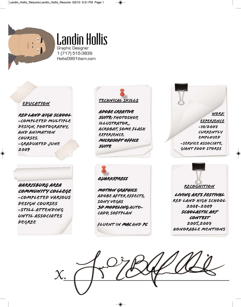
This is also not one of my favourite designs. I think it is a little plain colour-wise and could be a little bit more exciting. I do like the notepad idea, however and the page curls add abit more of an interesting look to the page. I also like how they have created a graphic of themselves rather than using a picture. It is a tricky one to call as to whether using an image of yourself is good or bad when it comes to your C.V. Some say do some say don't. You do not want to be judged on your appearance when applying for a job - nor should you be- but it can happen. However, will not including your picture make the employer think, what are they trying to hide? By creating a graphic of themselves this person has managed to show their creative skills, give the employer an idea of their appearance as well as side stepping the whole 'picture' issue.

This is one of my favourite designs, as I am thinking of a layout along similar lines myself. They clearly show what field they are interested in via their title and magazine layout design. I love their headlines such as 'The "Write" Guy for the Job' and 'Your Next Editor?' as they add abit of humour and a personal touch to the whole document. If I had one criticism it would be that I do not like the image they have used. It identifies well with the Writer theme but I think it looks abit boring and office-like.

This design is really creative and a great one for a graphic designer. It has a website design- perfect for anybody wanting to work within this area. I like the combinations of colour, I think the pink and grey work really nicely together. Even though it is pink it does not look overtly feminie- so much so I could not tell you whether it was a male or a females C.V which I think is great. I like the use of the graphic arrow pointing at a paragraph that they clearly would like you to read- giving it priority without making it the largest design on the page.
9.

This is a much more standard format and could even be seen as boring and unimaginitive. I love the graphic on the page though, of a guy with an open box for a head and thoughts ecaping from it. It represents a creative mind and I think it is a really nice image.
10.

This is a great design for again, graphic designers or designers in general. It has the tags with information on fanned out on one side and graphic designs on the other. It creates a nice overall image, however, I would say that the inforamtion on the cards does not really stand out.

This is another one of my favourite designs. It has really nice use of colour and I like how the information stems from the image- almost like a speech bubble. The image is not the main focus on the page thanks to the polkadot design overlaying it- leaving the content to standout. The white and pink work nicely together and it is quite a young, feminine design, reflecting this girls personality nicely.
All of the C.V's above are great inspiration for my own C.V and protfolio design. However, I will keep looking out for more creative designs.
Kate
No comments:
Post a Comment